The Junior Bellecour is a student-run business inspired by the Junior-Enterprise model, transposed to the world of art and graphic design schools. It was founded by a team of students in the Master's program in Art Direction and 3D Production at Bellecour School in Lyon.
Like an agency or studio, the Junior undertakes various professional projects independently, allowing its team to concretely embark on an entrepreneurial and creative experience.
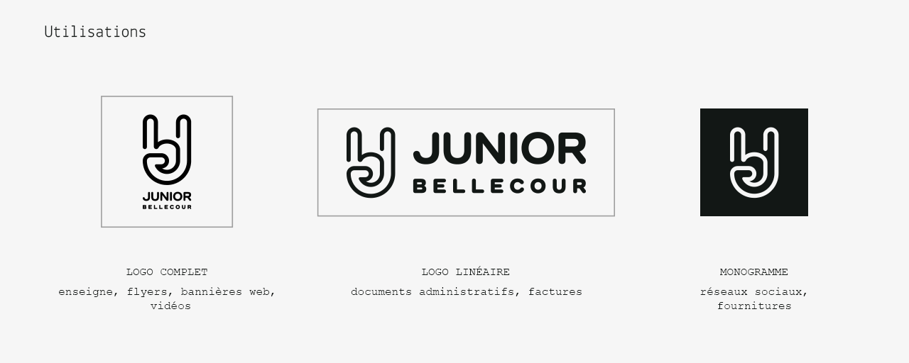


A member of the second graduating class of the Master's program, I served as president of the organization during the 2012-2013 academic year. It was on this occasion that I designed its visual identity and graphic system.
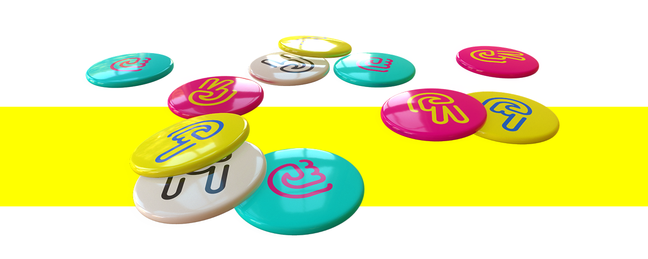
The values we aimed to convey combined dynamism, vitality, passion, and confidence. Therefore, it was essential to create a unifying symbol that was both solid and uninhibited. In a similar fashion, the color palette of Junior Bellecour had to also reflect the artistic environment in which it operates. This is why its colors directly evoke CMYK four-color printing and the world of “print,” further grounding the collective's projects in reality.
Among graphic designers and illustrators, there are those who enjoy drawing hands and readily recognize their technical aspect, and those who dislike them. Drawing a hand is no easy task, and designing an "original" hand is even more challenging.
The hand became the symbol of Junior Bellecour for several reasons. Firstly, the team was made up of five cohesive and complementary members. The hand is also the graphic designer's main tool and a powerful means of expression. Finally, it evokes the hand of the wooden mannequin, a symbol of artistic training.
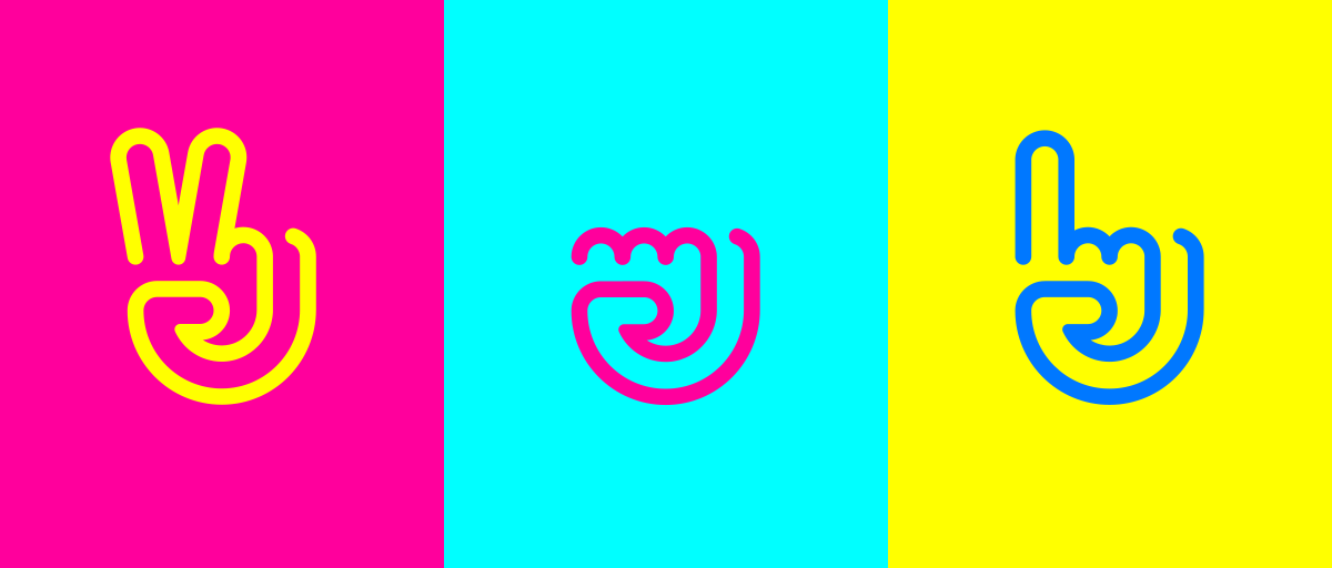
Junior Bellecour's projects were based on three pillars: cultural volunteer missions (Action), professional and paid commissions (Mission), and academic work (Function). To emphasize their distinction and leverage an inherently modular logo, we developed three new symbols.
Action is a clenched, activist fist covered in the warmth and solidarity of magenta.
Function raises its index finger to signify its educational nature, which is reinforced by blue.
Mission showcases the confident V of victory, which a bright yellow adorns with fire and ambition.
