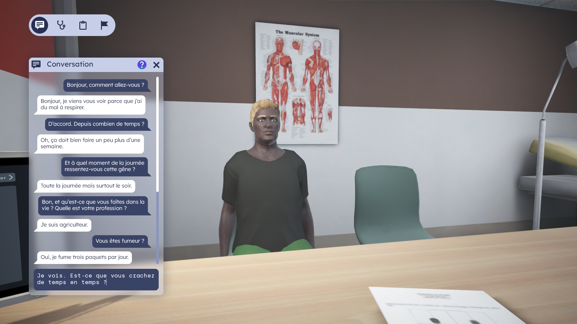
Sim2C is a hospital consultation simulation for medical students (and their professors) to learn clinical reasoning. Developed jointly with medical professionals, the Sim2C simulator closely resembles a real-life office situation. It allows for dynamic conversations with virtual patients and the opportunity to work on numerous clinical cases across a variety of disciplines.
Dessinandier was tasked not only with refreshing and strengthening the visual identity but also with establishing a new artistic direction for the application (and designing its UX/UI).
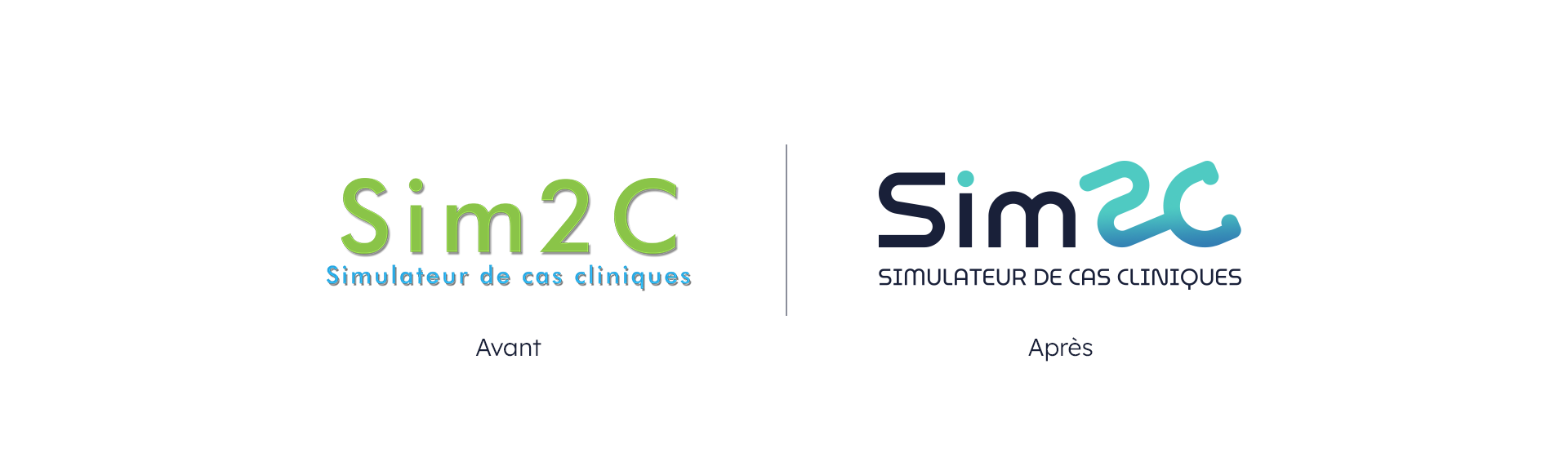
The new logotype is sober and minimalist, while also more pertinent: it is playful, clever, and evocative. It is more modern and better suited to the academic environment to which it is addressed.
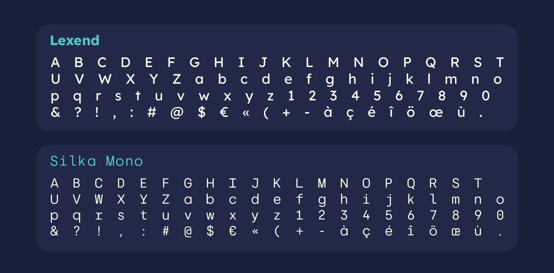
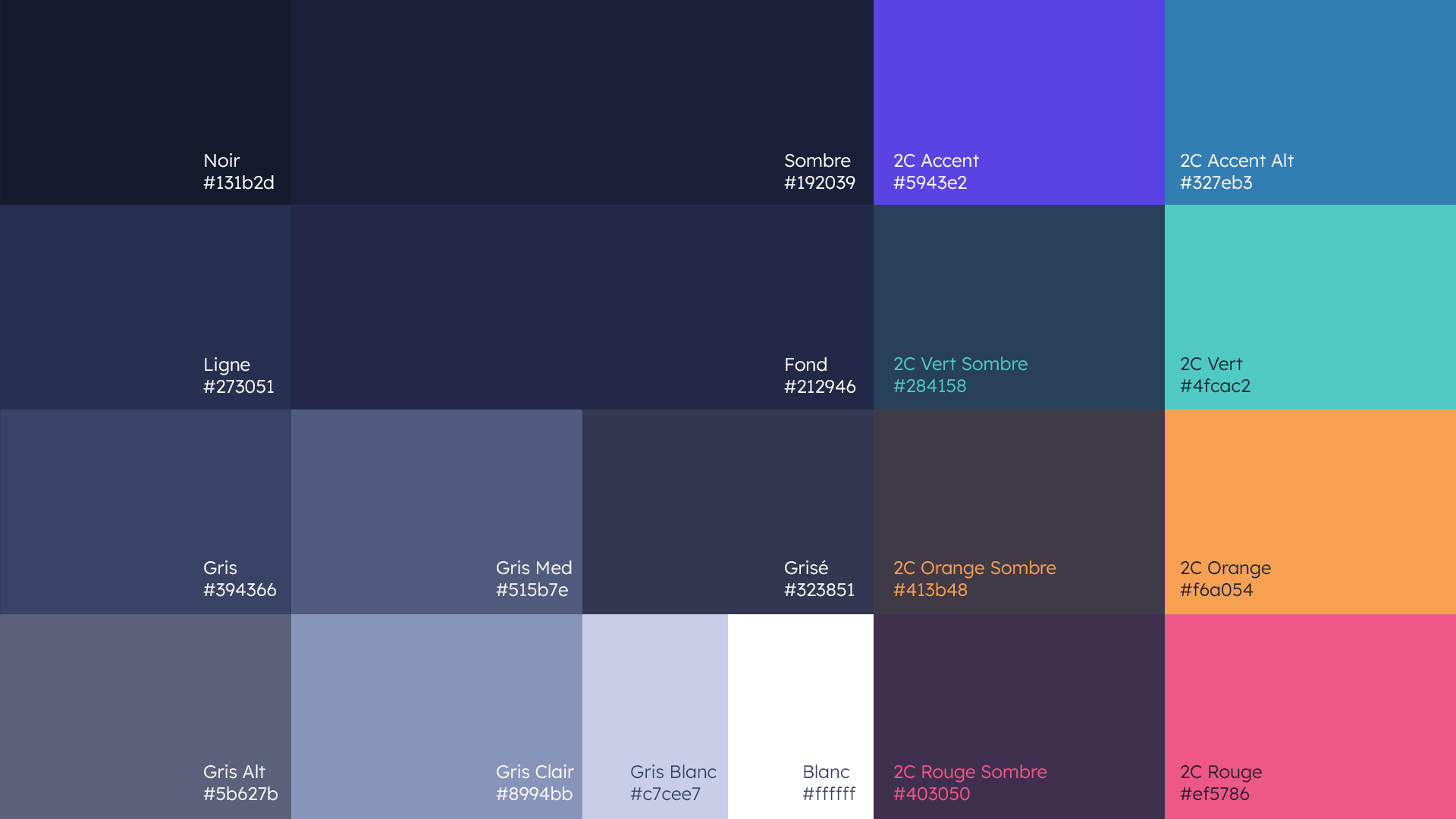
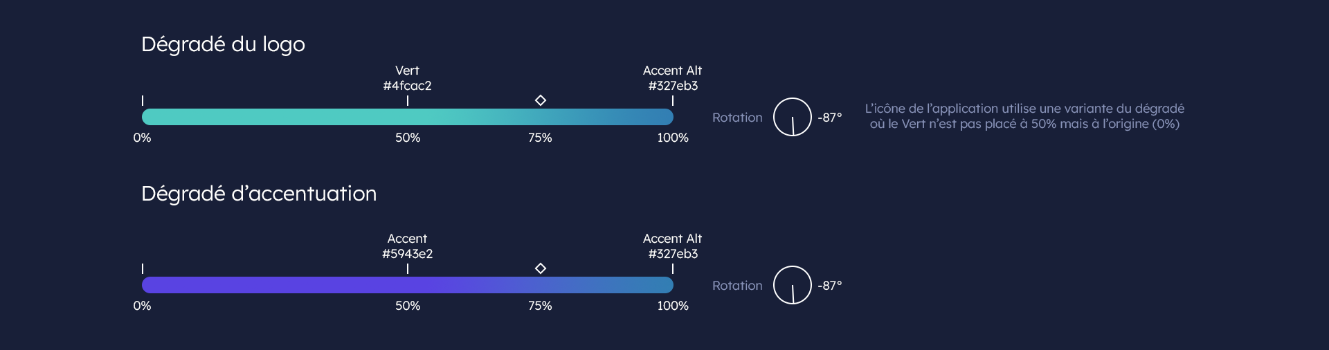
To differentiate Sim2C from its creators, the typography and color scheme have been changed (a custom typeface was designed for the occasion). This was also done to improve legibility, reduce eye strain, and create a more iconic, memorable, and unifying symbol.
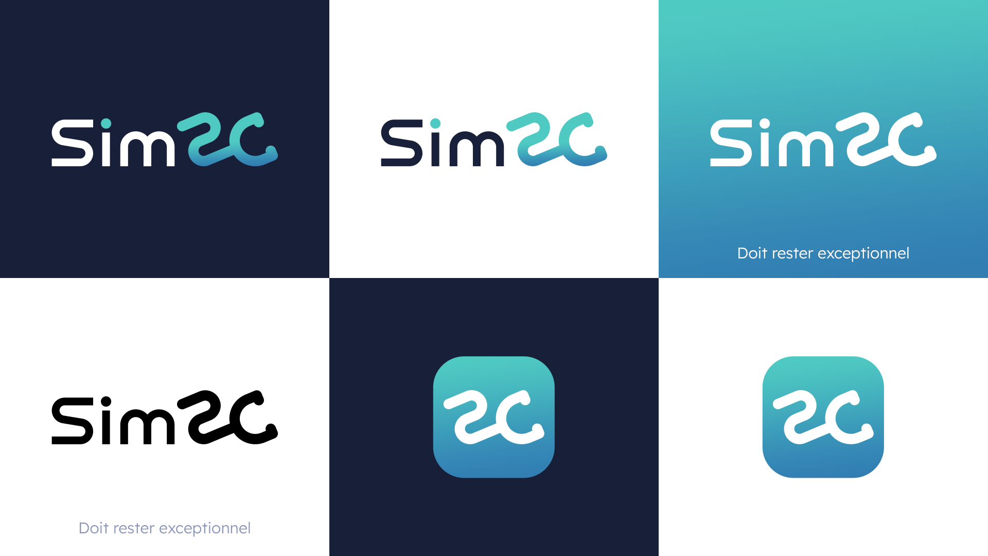
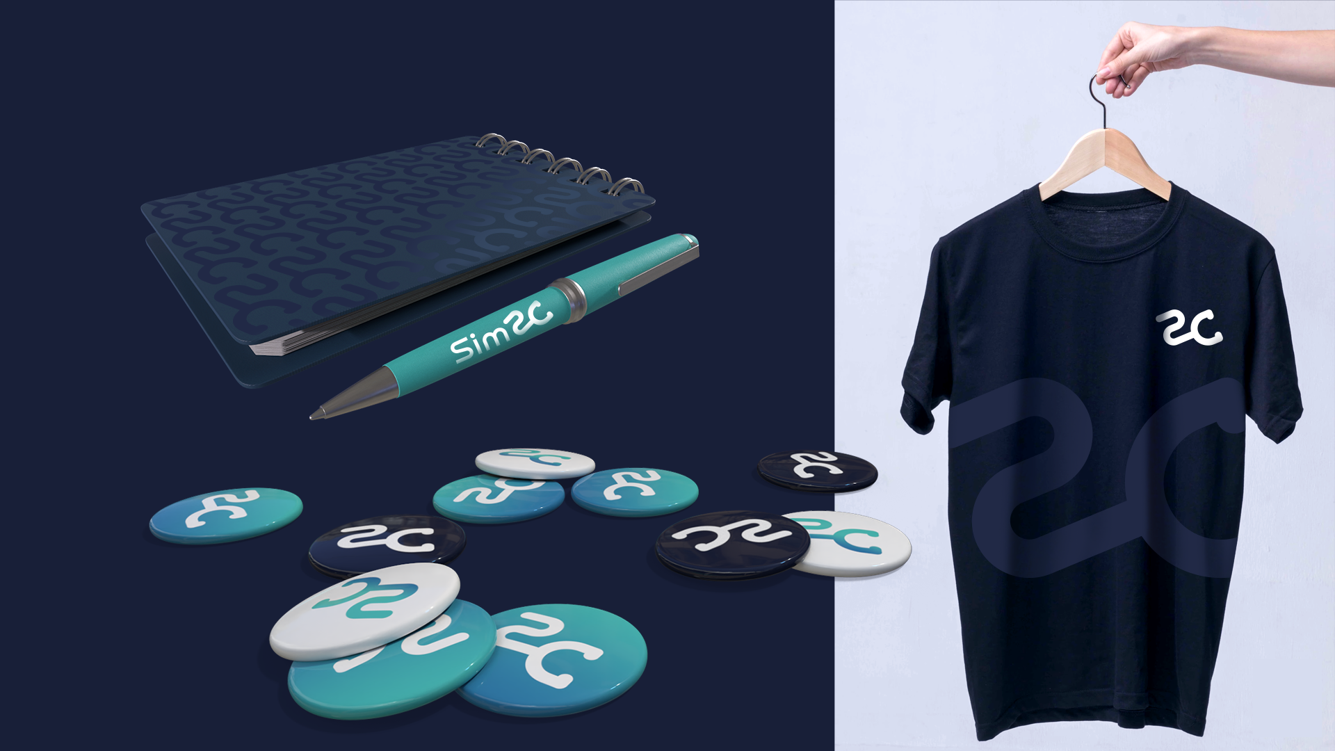
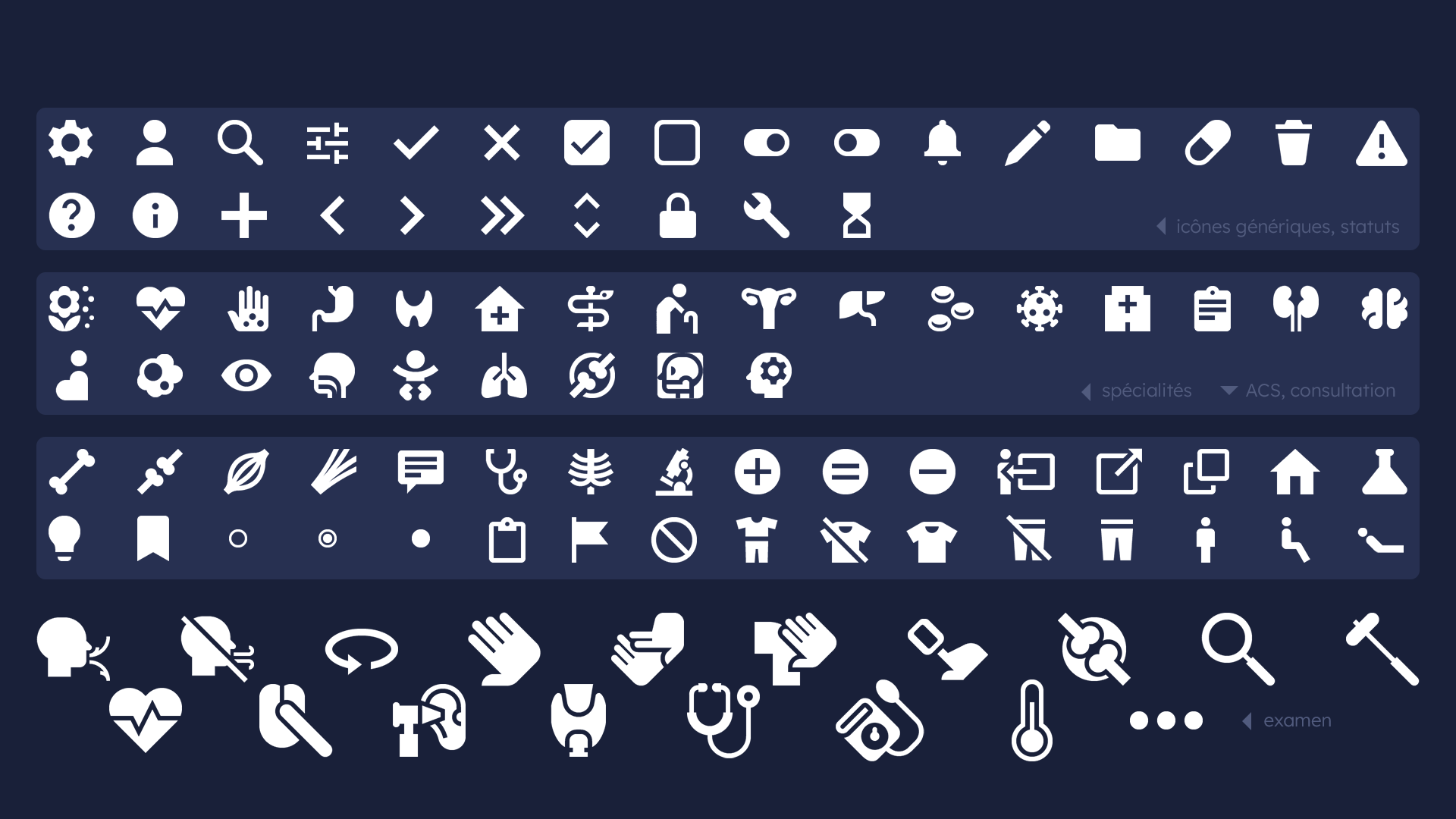
Finally, this change in color and personality supports and justifies the establishment of a new artistic direction with its new palette, icons, and energy.


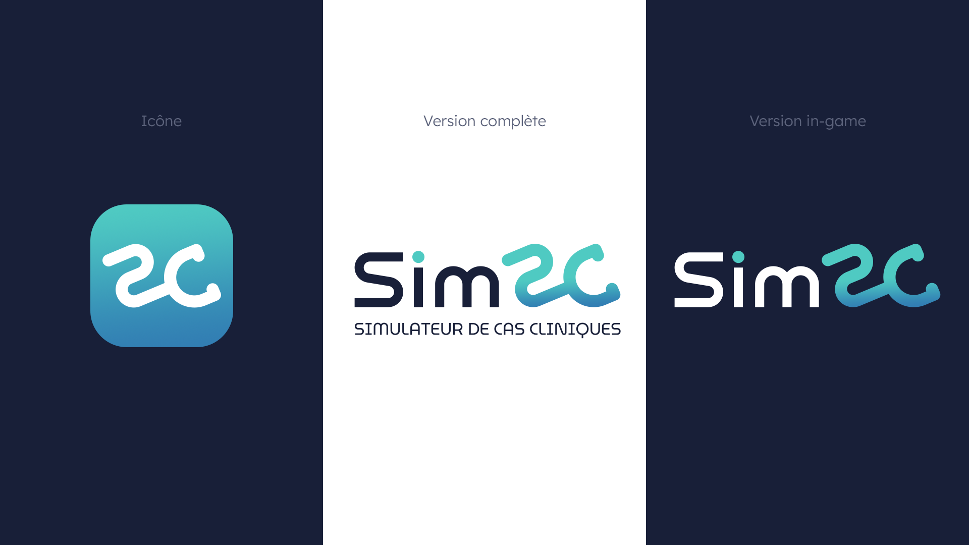
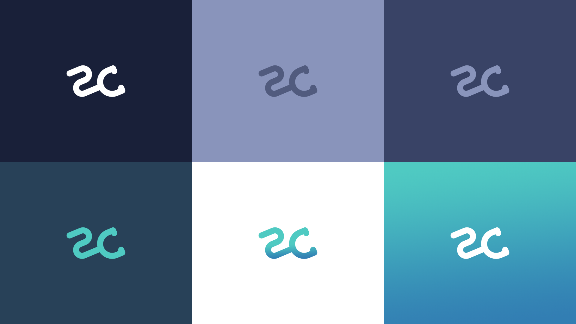
The uniqueness of Sim2C lies in its acronym, "2C." It is precisely this acronym that gives the product its personality by playing on a double meaning. The new visual identity follows the same idea, complemented by a play on forms that reinforces the meaning, allowing for an immediate understanding of the medical nature of the product. The "2C" acronym thus becomes a stethoscope, the universal symbol of medical consultations.


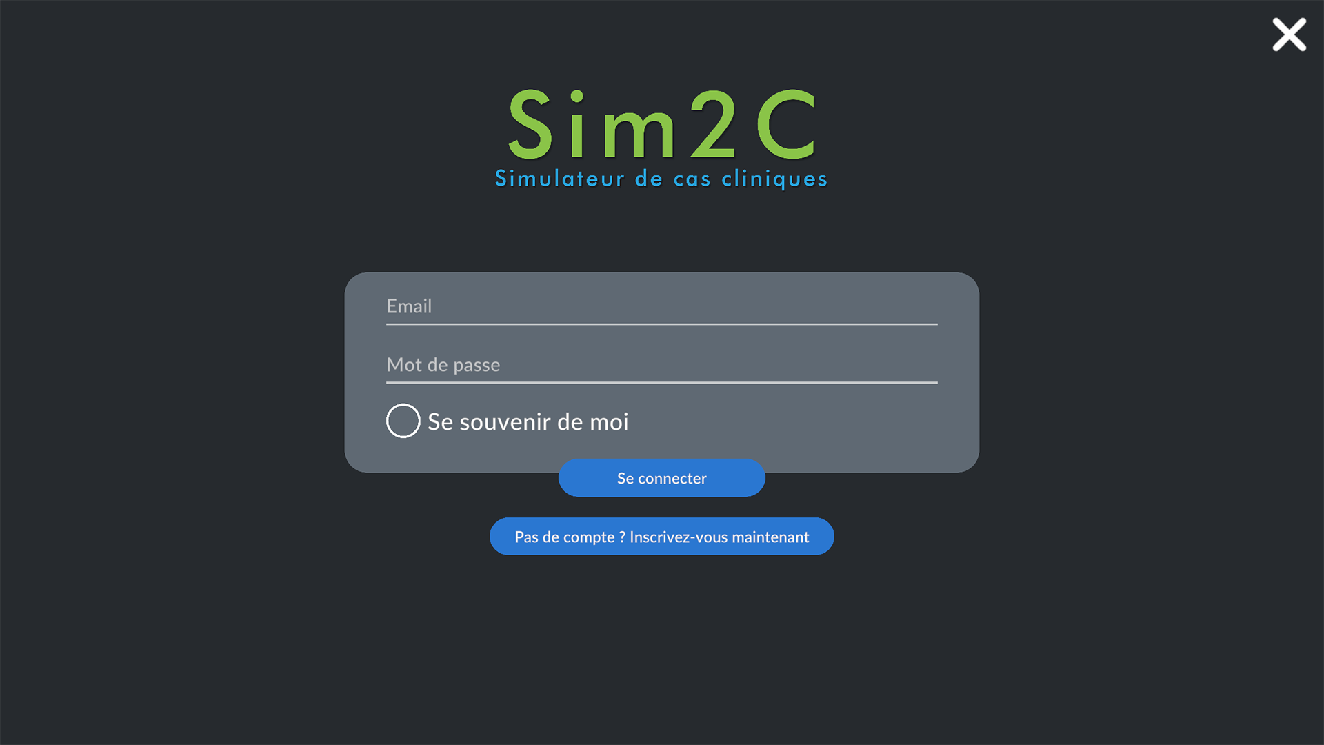
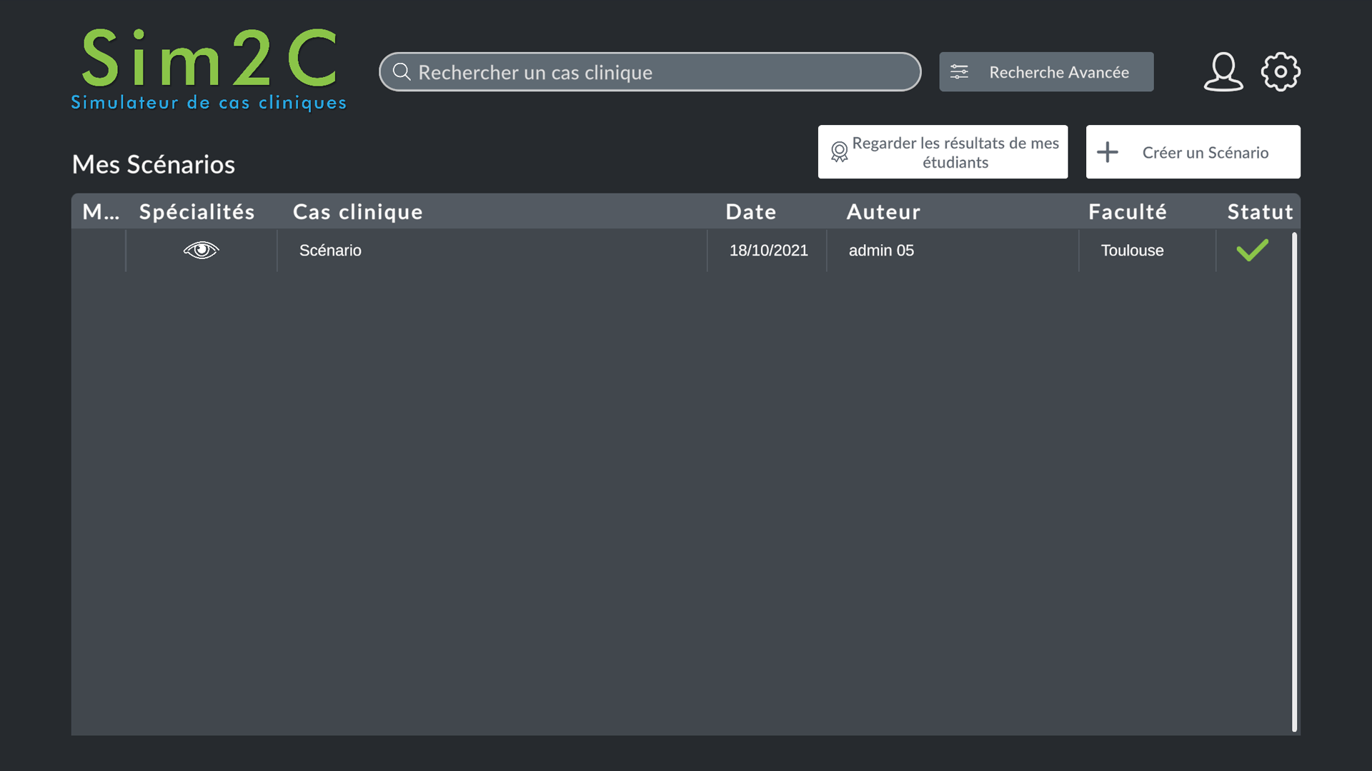
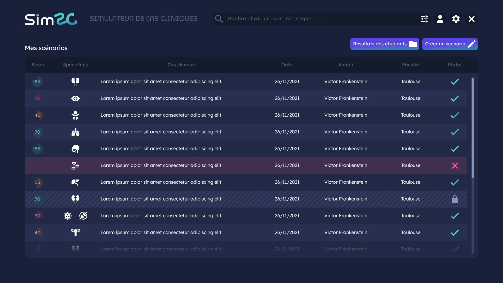
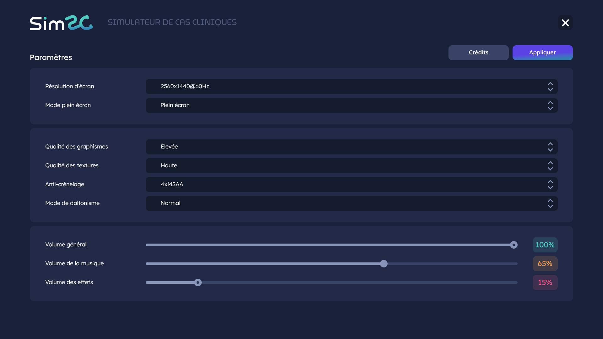
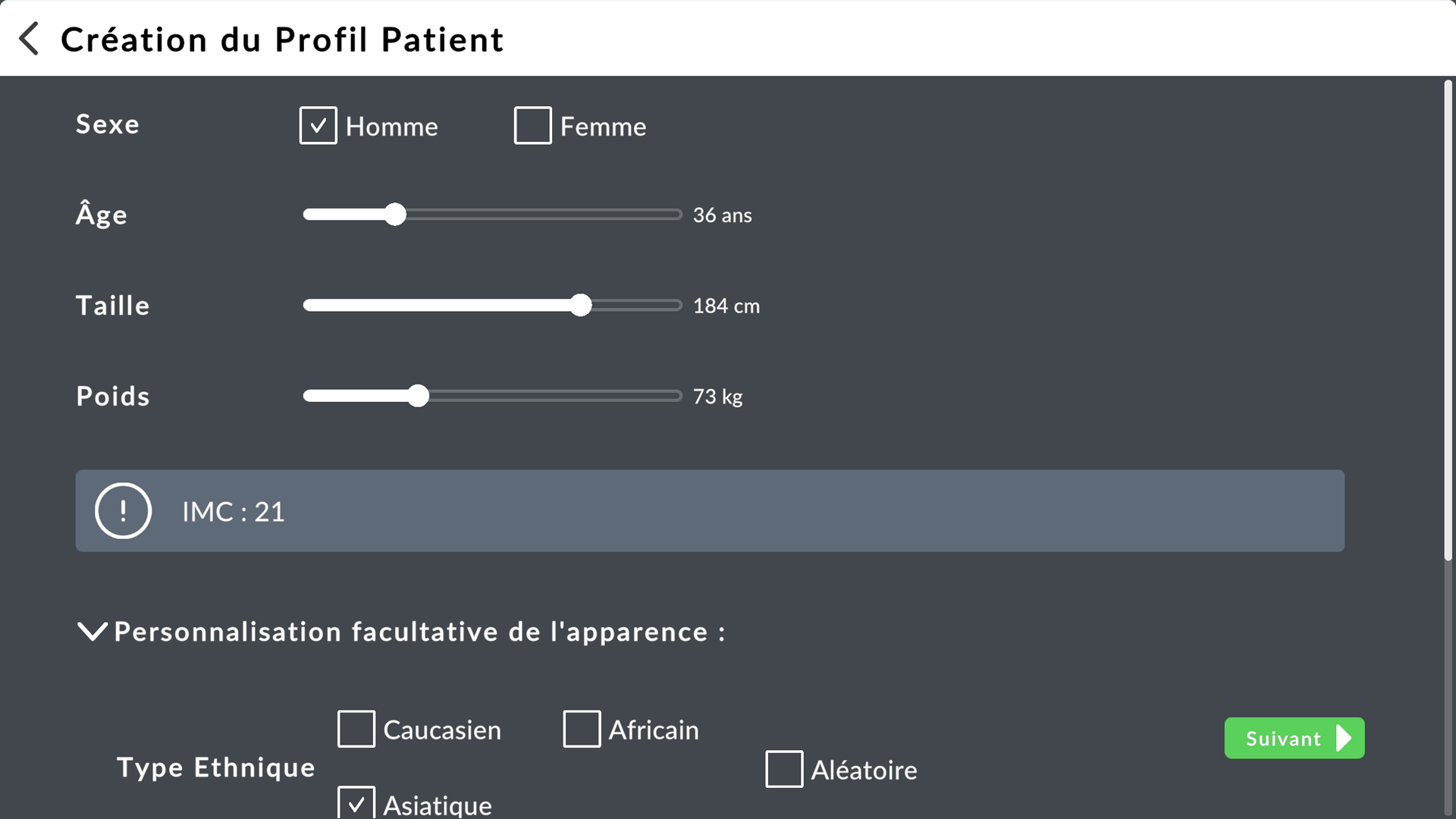
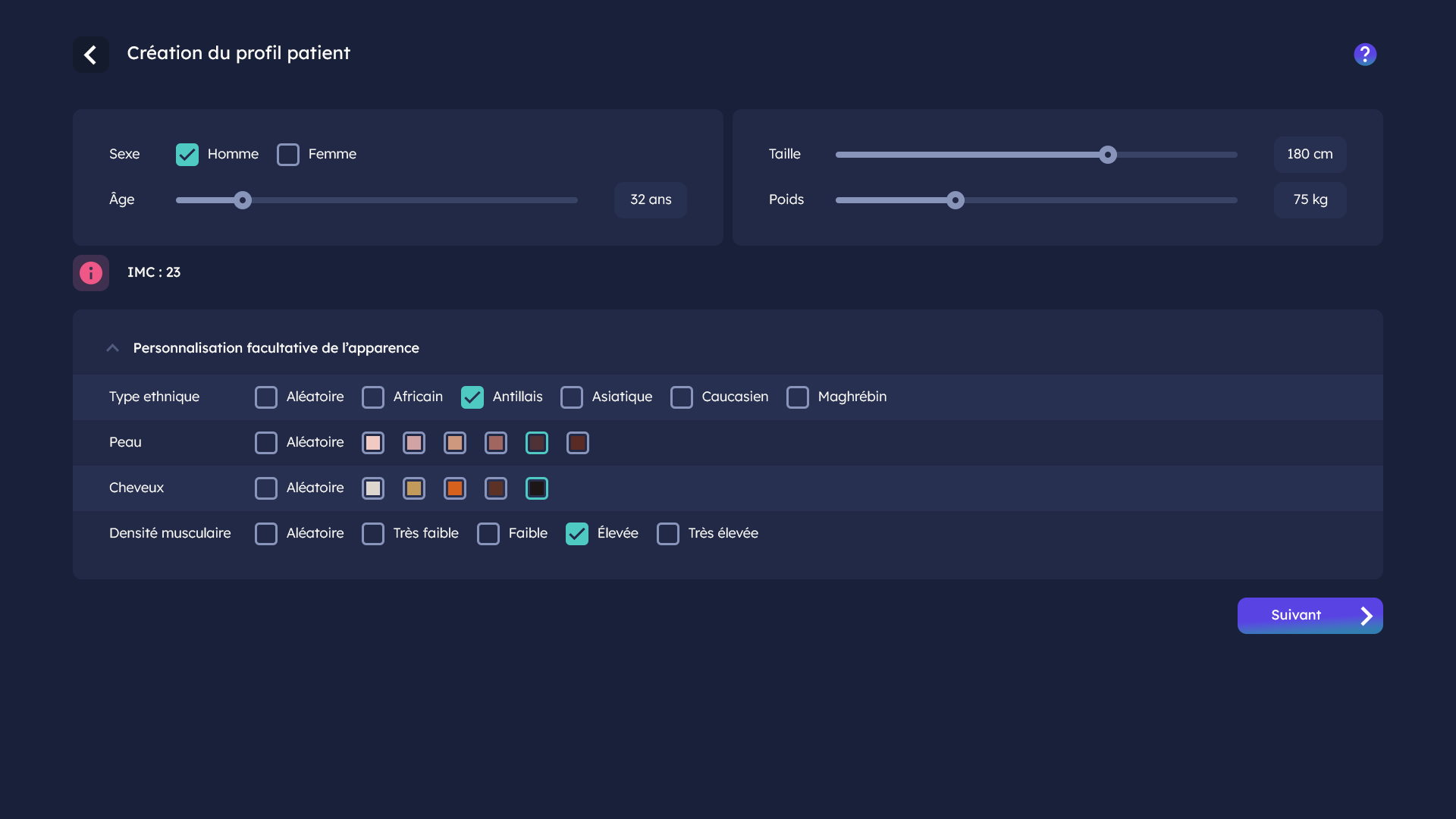
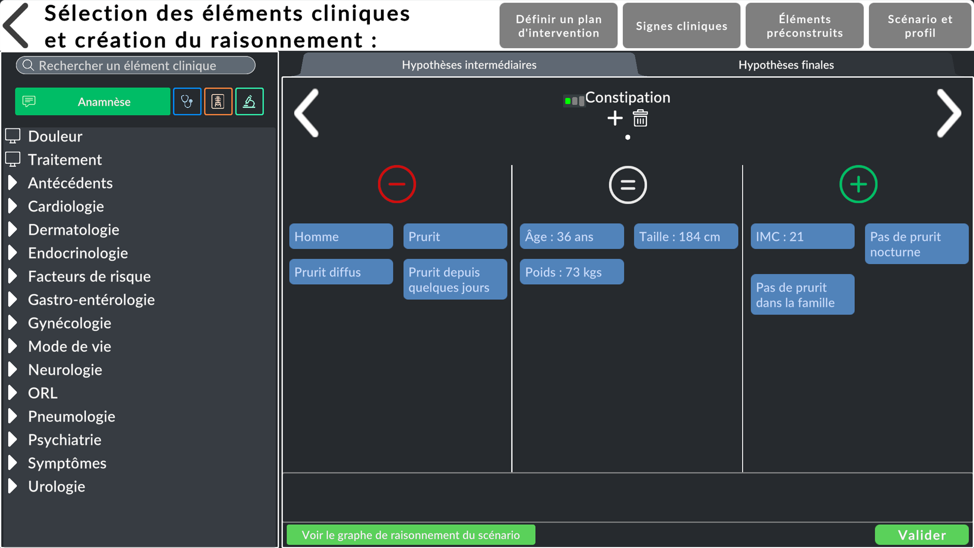
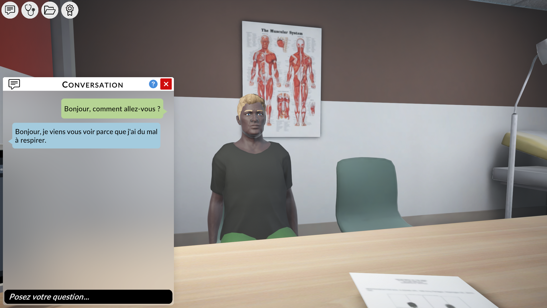
The following examples illustrate the implementation of the new artistic direction. Each time, the first image shows the currently used UI, followed by its new version.