Specializing in new technologies and augmented reality, Spooklight Studio is an innovative company based in Geneva. It aims to create and develop magical experiences where images are no longer confined to screens but blend into our environment.
To convey its DNA and embody its philosophy, the studio needed a visual identity that was both modern and playful.

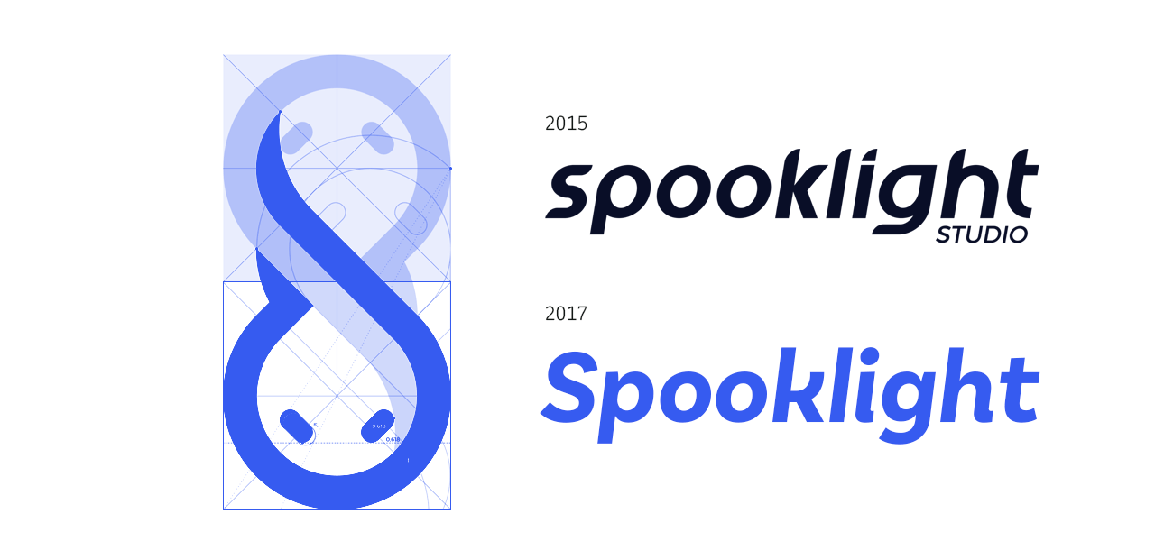
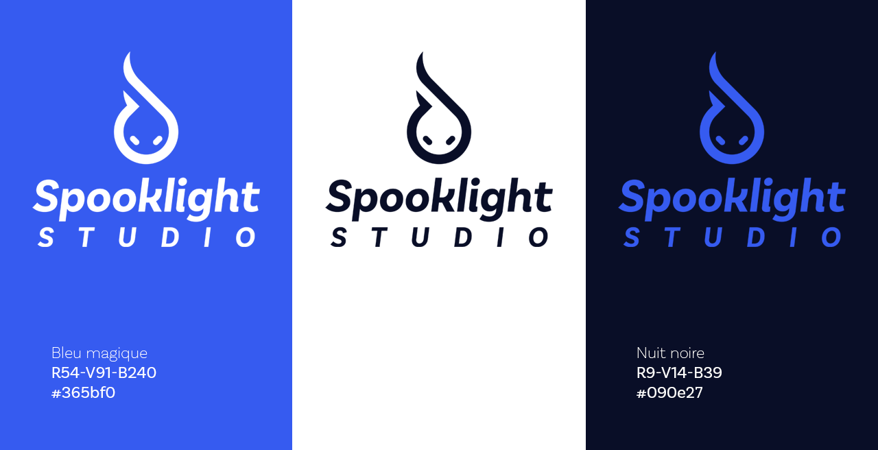
From the first sketches of the logo, the choice of italics came naturally. It represents movement, evolution, and the dynamism inherent in the startup ecosystem.
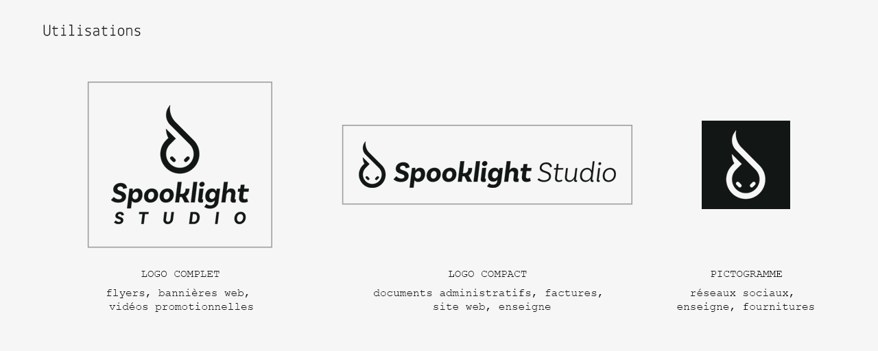
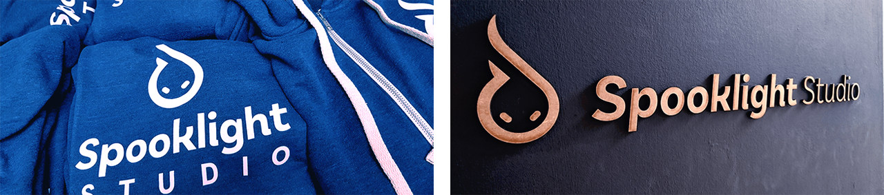
Initially, I was inspired by the pictogram to draw the characters, subtly recalling the flame within it.
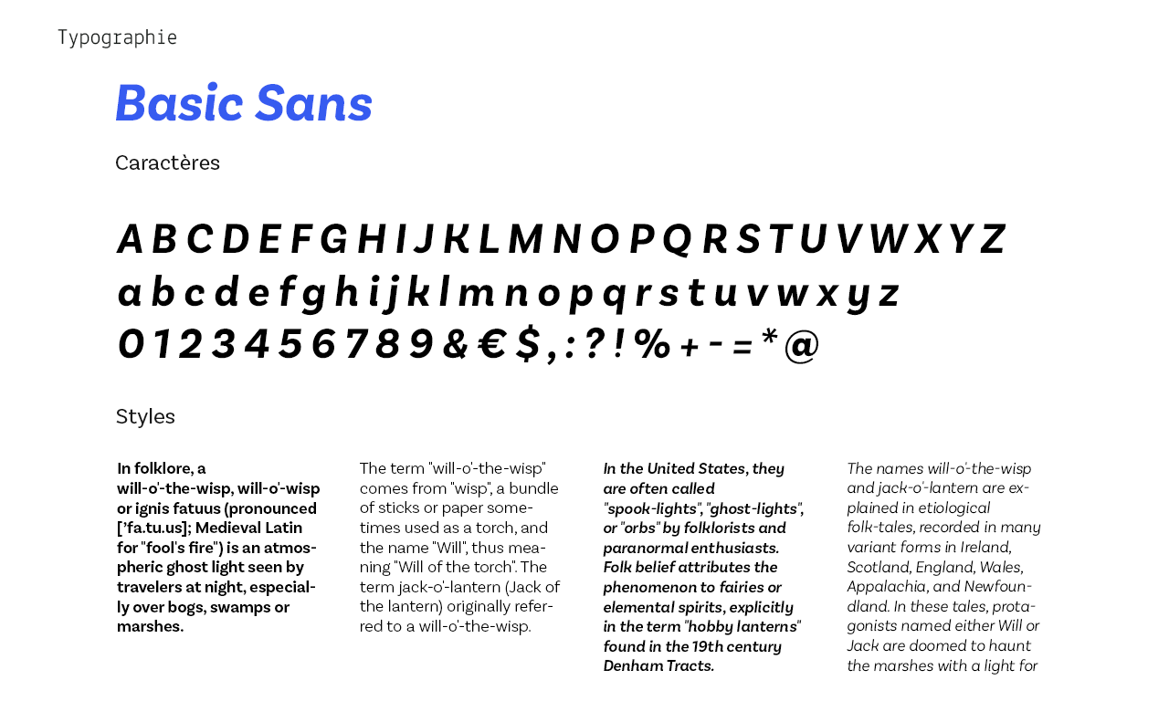
In the end, the Basic Sans type family was preferred for its blend of simplicity and playfulness during a redesign undertaken when the company moved in 2017.


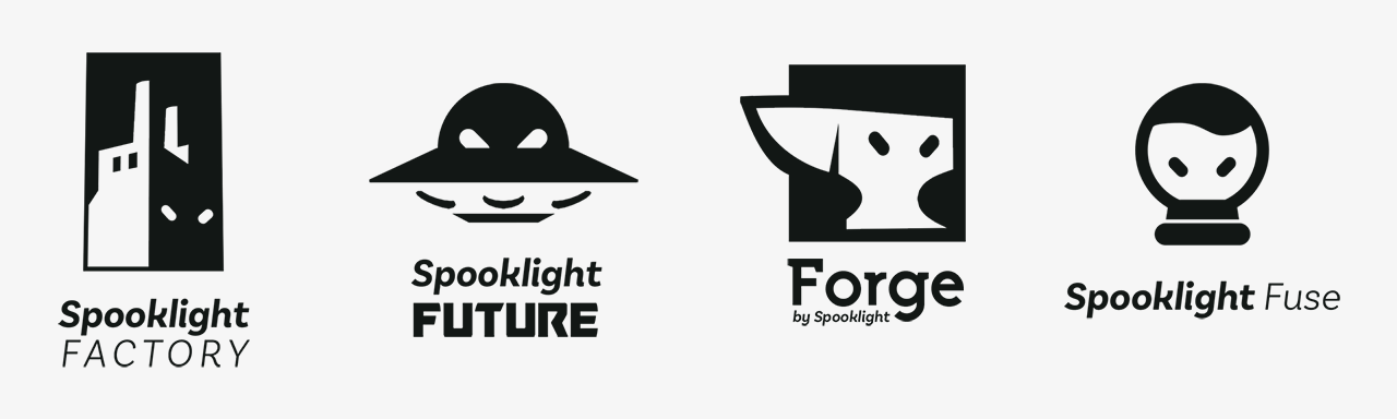
In late 2018, Spooklight Studio shifted towards service offerings and the development of its Research & Development department. To support this new positioning, it was necessary to provide the division with its own identity to distinguish it from the Product department and make it more visible in the market.
I proposed four concepts, each with a strong idea and a suitable name. The challenge was to allow for the coexistence of the new logo with the original one in a consistent and clear manner.
The concept of Forge was chosen for its artisanal and dynamic dimension (and the idea of "fire" that recalls the flame of Spooklight).