
ReNovo, a Swiss company based in Lausanne, specializes in wall and floor renovation and is a professional in tiling installation in the Vaud region.
As part of its development and to refresh its visual identity, ReNovo enlisted the services of Dessinandier.
As part of its development and to refresh its visual identity, ReNovo enlisted the services of Dessinandier.
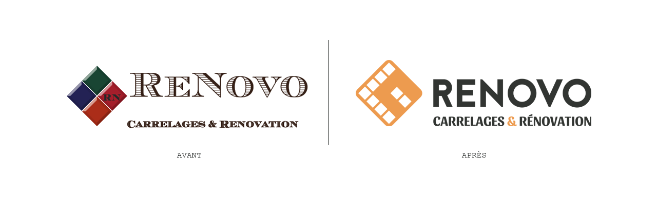
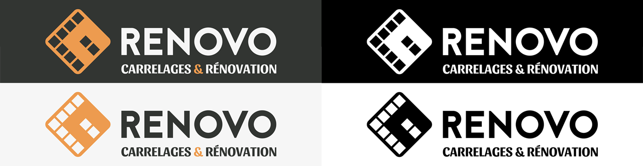
The redesign of ReNovo's visual identity involved incorporating elements of the original design. The original pictogram consisted of four beveled diamonds. The challenge was to recapture the essence of the initial iteration by retaining the orientation of the symbol (a square tilted at 45°) while modernizing its design. The concept of tiling and the integration of the letters R and N were also revisited, along with the typography (which no longer varies in case).
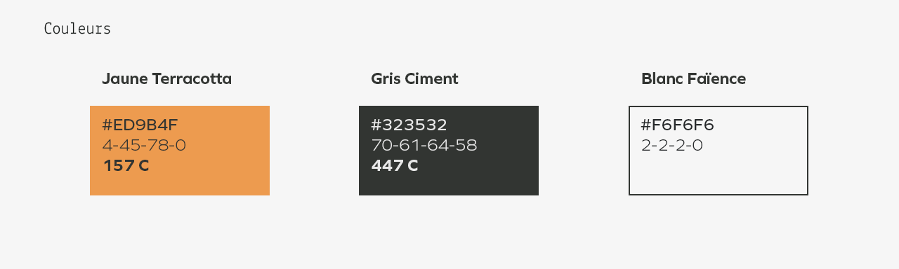
Finally, a bolder and warmer color replaces the previous combination.
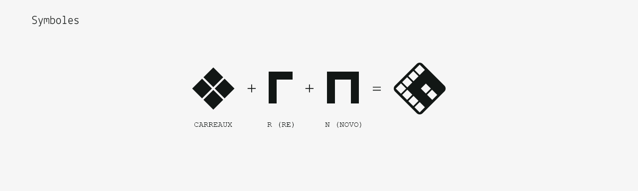
The pictogram that embodies ReNovo's new identity is a distillation of its image. It represents the company's core business and, through the methodical arrangement of the tiles that compose it, showcases the company's expertise.
The two strong letters of ReNovo, historically present in the icon, are also included to strengthen the brand's heritage.


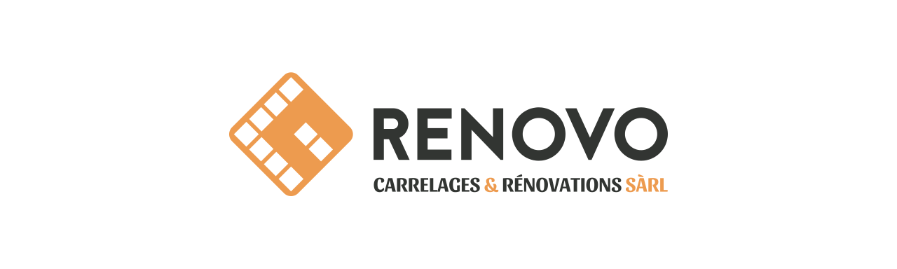
In mid-2018, ReNovo once again engaged the services of Dessinandier to slightly evolve the company's visual identity to support its growth. Due to its success, ReNovo changed its legal structure to better meet demands.
A notable success that may, in part, be attributed to the adoption of a more fitting brand image.