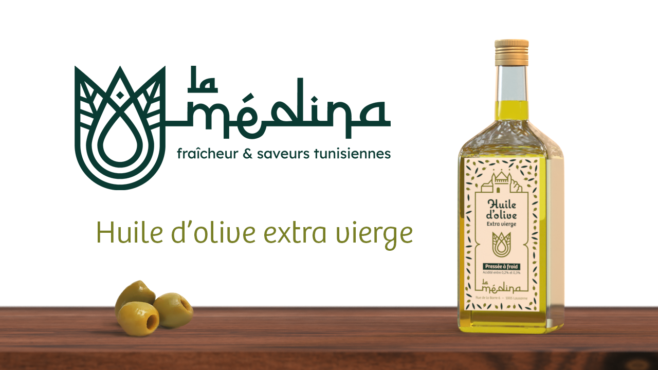
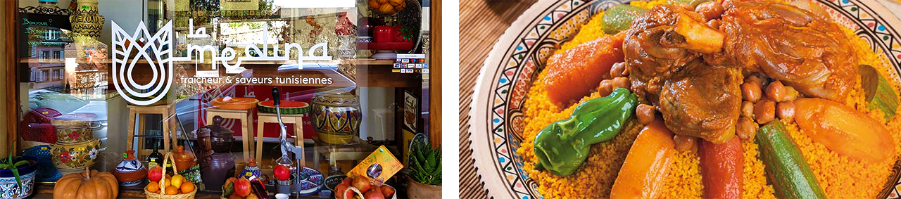
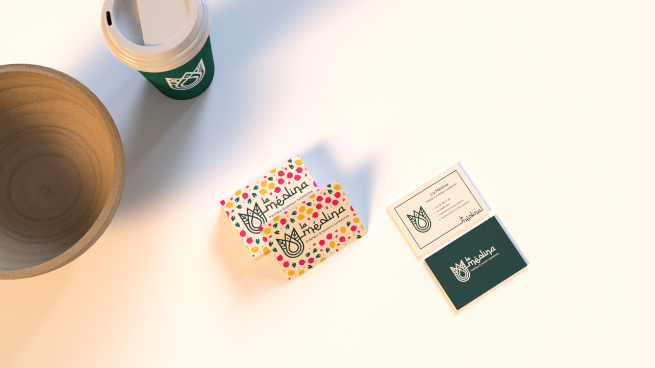
La Médina is a restaurant located in Lausanne, Switzerland. Its mission is to introduce all the flavors of traditional Tunisian cuisine. But La Médina is also a juice bar that lets you create your own drinks using fresh products. Among its specialties are couscous (of course) and pomegranate juice.
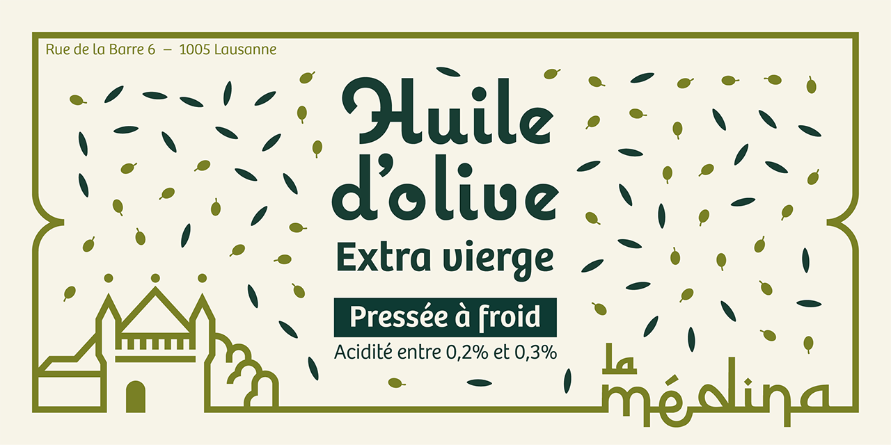
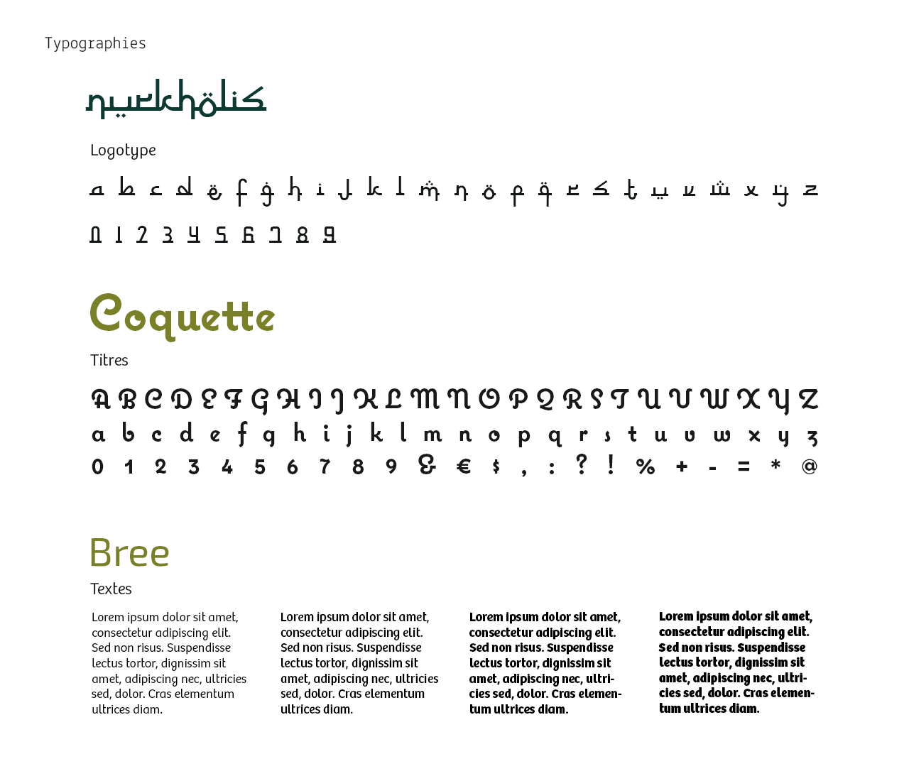
After much research and experimentation, the typographic choice ultimately fell on Nurkholis. A typeface that had the benefit of being both Latin in form and Arabic in inspiration. Complementing the pictogram, it alternates straight lines and curves, connecting each letter with a line. It is from this same line that the visual unity of the different communication materials flows.

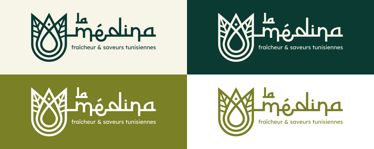
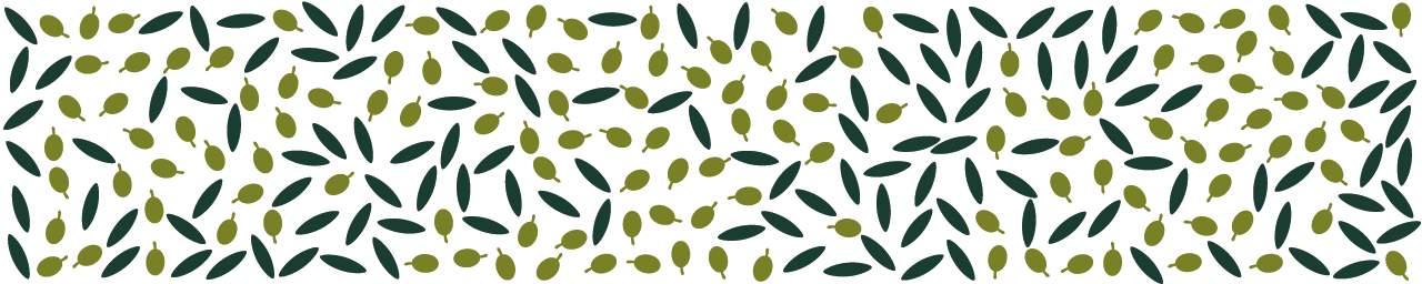
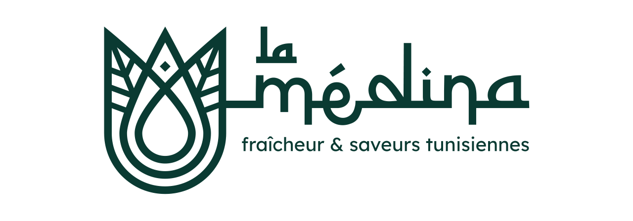
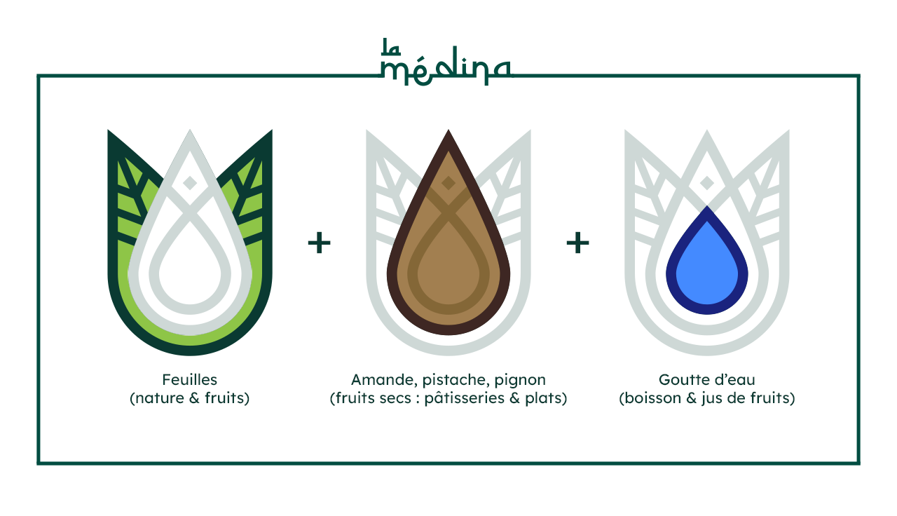
Inspired by the illuminations of Arabic manuscripts and the architecture of the medinas of Tunis and Fez, the pictogram of La Médina brings together all these elements in a single symbol. It also evokes an almond, a pistachio, a pine nut, or a date, referencing the dried fruits used in Tunisian pastries and the seasoning of dishes. The symbol also resembles a leaf, a drop of water, and the crown of a pomegranate to emphasize the importance of the juices served daily at the establishment.


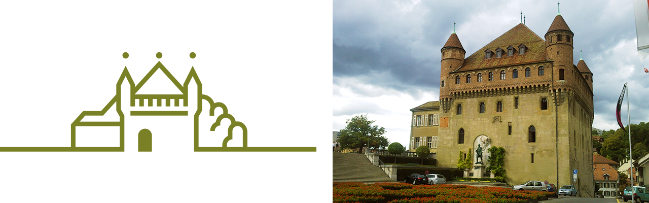
La Médina also features a grocery store offering various Tunisian regional products, particularly its famous olive oil. In a quest for quality and to illustrate both this pursuit of excellence and the meeting of Switzerland and Tunisia, the owner wanted the Château Saint-Maire in Lausanne (beneath which the restaurant is located) to appear on the bottles and packaging. Therefore, the challenge was to depict the building following the same principle as the logotype: on a single line.