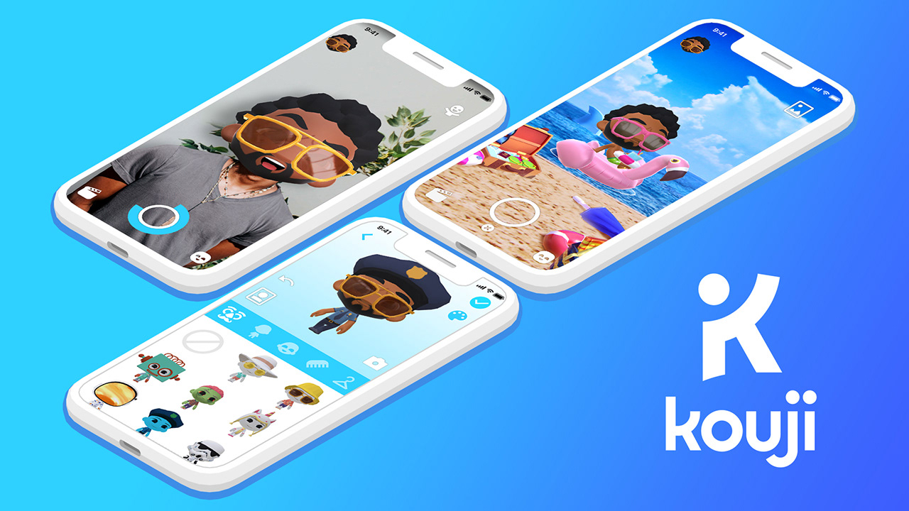
Kouji is an augmented reality messaging app that lets you send short videos to your friends (like Snapchat) through your favorite apps.
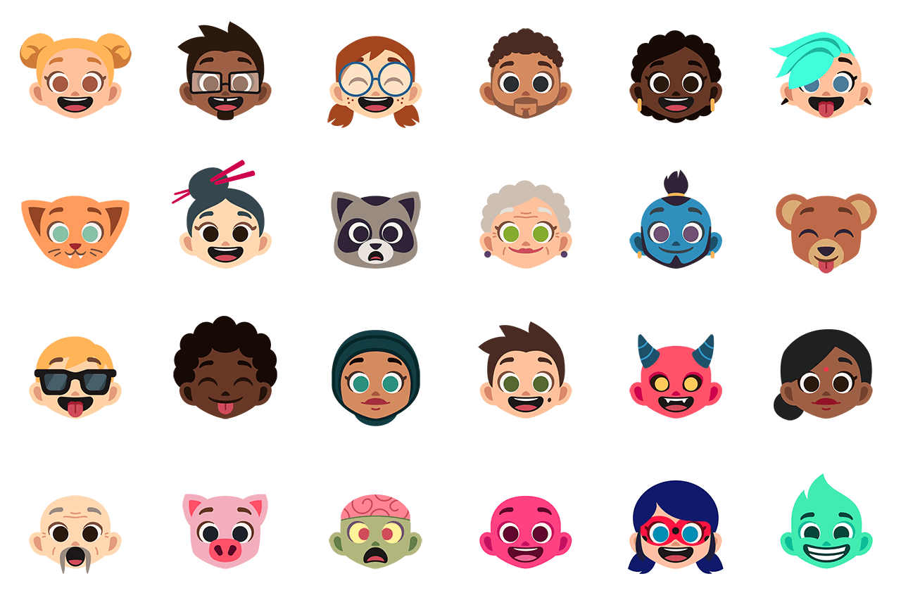
Set up your avatar with millions of combinations offered by the character editor and place it in whimsical situations, either in your environment or on images of your choice.


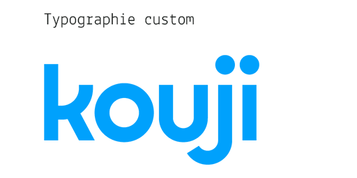
Finding the right balance between angles and curves led me to design a custom typeface. It needed to convey the idea of an app that combines joviality with precision.
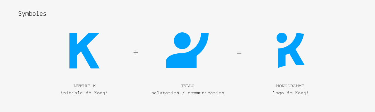
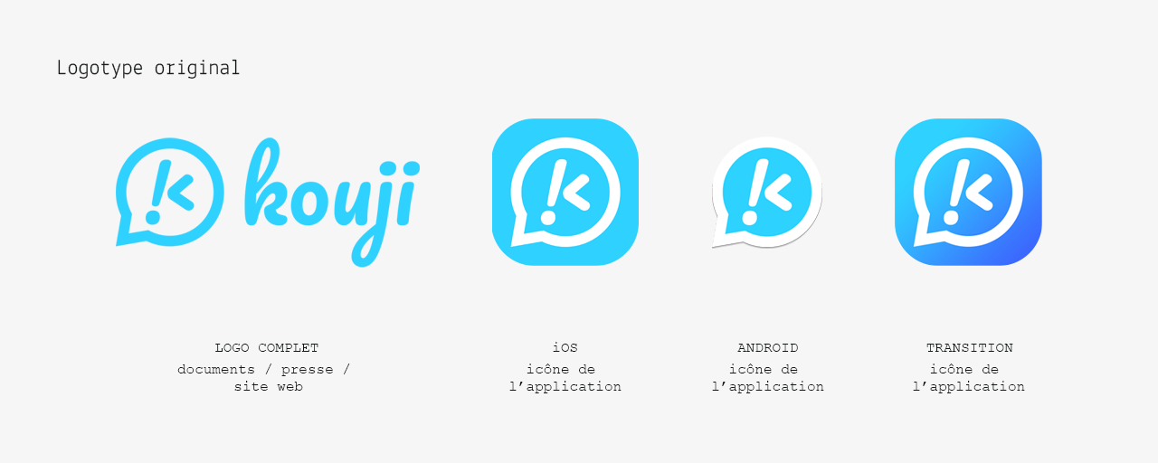
At its launch in 2017, I designed a "temporary" logo that was ultimately adopted across all communication channels and within the app itself. Since the product's positioning was not yet established, the only concept I was asked to convey was messaging. That's why the logotype features a conversation bubble. I stylized the internal monogram to be reproducible on any keyboard, regardless of language: !<.
The following year, it became imperative to evolve the emblem to match the app's new positioning. The transition icon (below) illustrates the shift from the original logotype to the current symbol (through its gradient).
While the messaging aspect was not yet called into question, the presence of avatars (central to the experience offered by Kouji) was missing. So, I worked on the evolution of the original logotype by incorporating an affable character literally bursting with joy into the existing bubble. The result (above) may have lacked legibility in small sizes and seemed more suited to a children's audience than the teenagers the app aimed for.

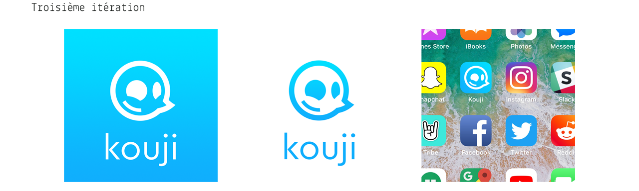
Keeping the same focus, I simplified the previous design while ensuring its legibility. The result is a more streamlined logotype that still maintains the key concepts: avatar and messaging. I took advantage of the presence of a bubble to make it into a face and, instead of sketching an emoji, I used the point to create the character's nose, making it more "substantial" than an emoticon.
In the meantime, the marketing strategy shifted away from messaging in its communication, making this design less relevant.
In the meantime, the marketing strategy shifted away from messaging in its communication, making this design less relevant.
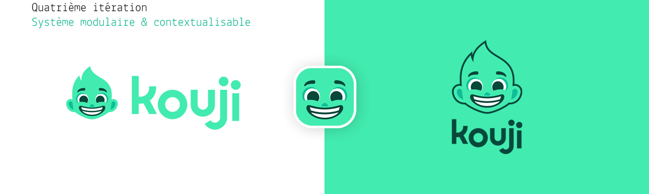


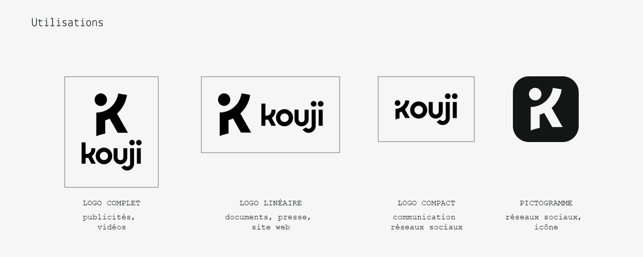
The fourth and penultimate iteration, the modular system I developed for Kouji, was a contextualizable visual identity project. Ambitious, perhaps, and possibly avant-garde. In any case, societally complex.
It relied on the use of a stylized face reminiscent (in a simplified version) of the app's avatars. The "international face" with flaming hair avoided gender or ethnic group connotations while recalling the will-o'-the-wisps of Spooklight Studio. Mint green was chosen over the usual blue to give the app more character, personality, energy, and fun, as well as some eccentricity and freshness compared to competing apps.
The system relied on variations of the face based on cultures and events. By retaining the product name and its typography, the placement of elements, and the stylization of the face, the design could adapt its appearance while maintaining its identity. The logotype could then adjust to its environment and audience, highlighting the endless possibilities of the avatar editor.
The system received unanimous approval, but its deployment was delayed and then shelved due to numerous fluctuations in marketing strategy. Perhaps this was not a bad thing, as figurative logotypes always risk becoming outdated more quickly…